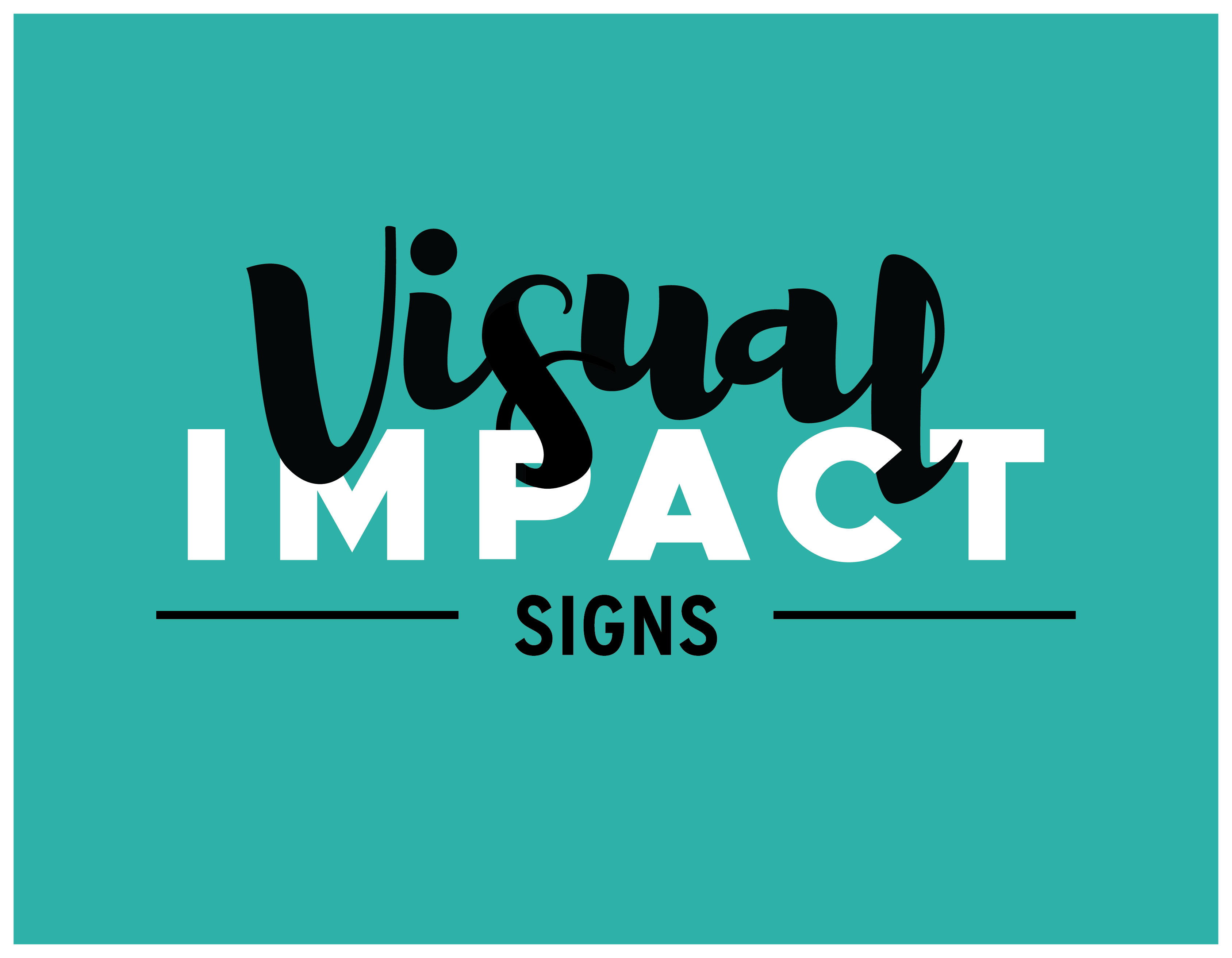
While working at Visual Impact Signs, I created an updated version of the current logo, which, when I presented it, was adopted as our new logo. I wanted a simpler, cleaner look that could be used across our business applications as well as to brand our in-house materials.
Elements
+ Logotype
Programs
+ Illustrator
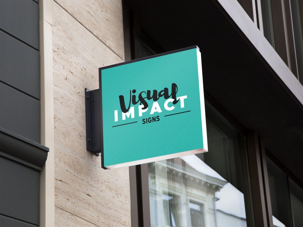
The original logo was part blue and part green, accordingly, it had a finite amount of utilization on/with which it would look appropriate. I designed this logo to work on top of any coloured background. Seen here on teal, my nod to the foregoing palette, it also works on top of photos, t-shirts and as stickers.
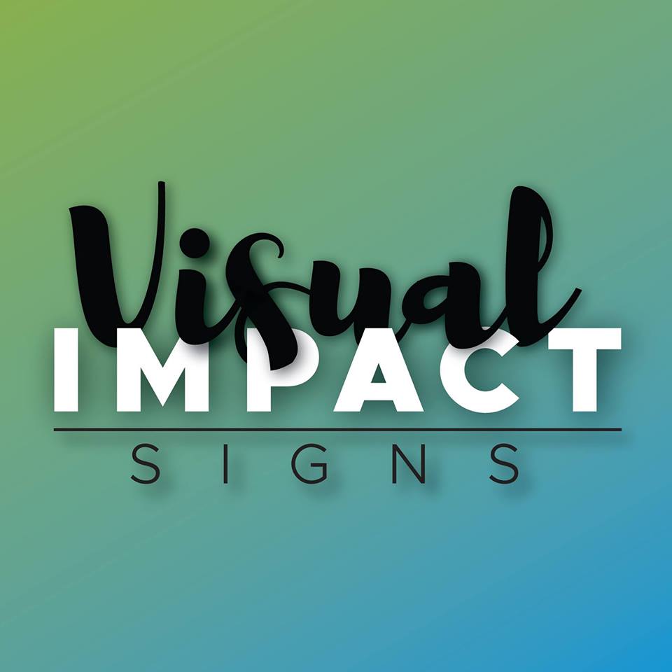
As a company named Visual Impact, I thought it important to imbue the logo with a sense of dynamism. I interwove the script with a contra-coloured bold sans serif to give the idea of multi-dimensionality and action. My original version was much less finessed than the final, and I used a gradient background to keep everyone happy with the colour system. I also needed to include Signs, without overwhelming the interplay happening above. Originally, I set it in the same font-family as “impact”, and kerned it wider. I also used a drop shadow to integrate the concept of three-dimensionality and distance. However, reviewing this logo for my portfolio, I went back and played with it further, and I am much happier with the results.
For me, refining is a Zen experiment. My goal is always to have only the elements that absolutely must be there to convey the sense of the concept. I was happy to remove the gradient, but even happier when I could dispense with the drop shadow, due to a more contemplative interplay of letters. There is more inherent drama in the final version, without a need for drop shadow, and the arching script is much more considered, giving a cohesive look to the entire block of text. I reconceptualized how I was going to integrate “signs”, setting it in a narrow sans-serif slightly apart from the upper bloc. To keep it from visually drifting I included a horizontal line through the top. It also cognates the visual idea of a swing sign on a bar.