This festival occurs each year and features up-and-coming female authors that the board members feel deserve recognition. I was selected from a pool of applicants by my portfolio and originally presented three concepts for consideration. The one shown here was an out-branching of one of those original three. The concept was cut-paper, as one of the Literary Women mentioned that they were interested in some type of silhouette design.
Elements
+ Visual identity
+ Printed materials
Programs
+ InDesign
+ Illustrator
Extras
+ Illustration assets
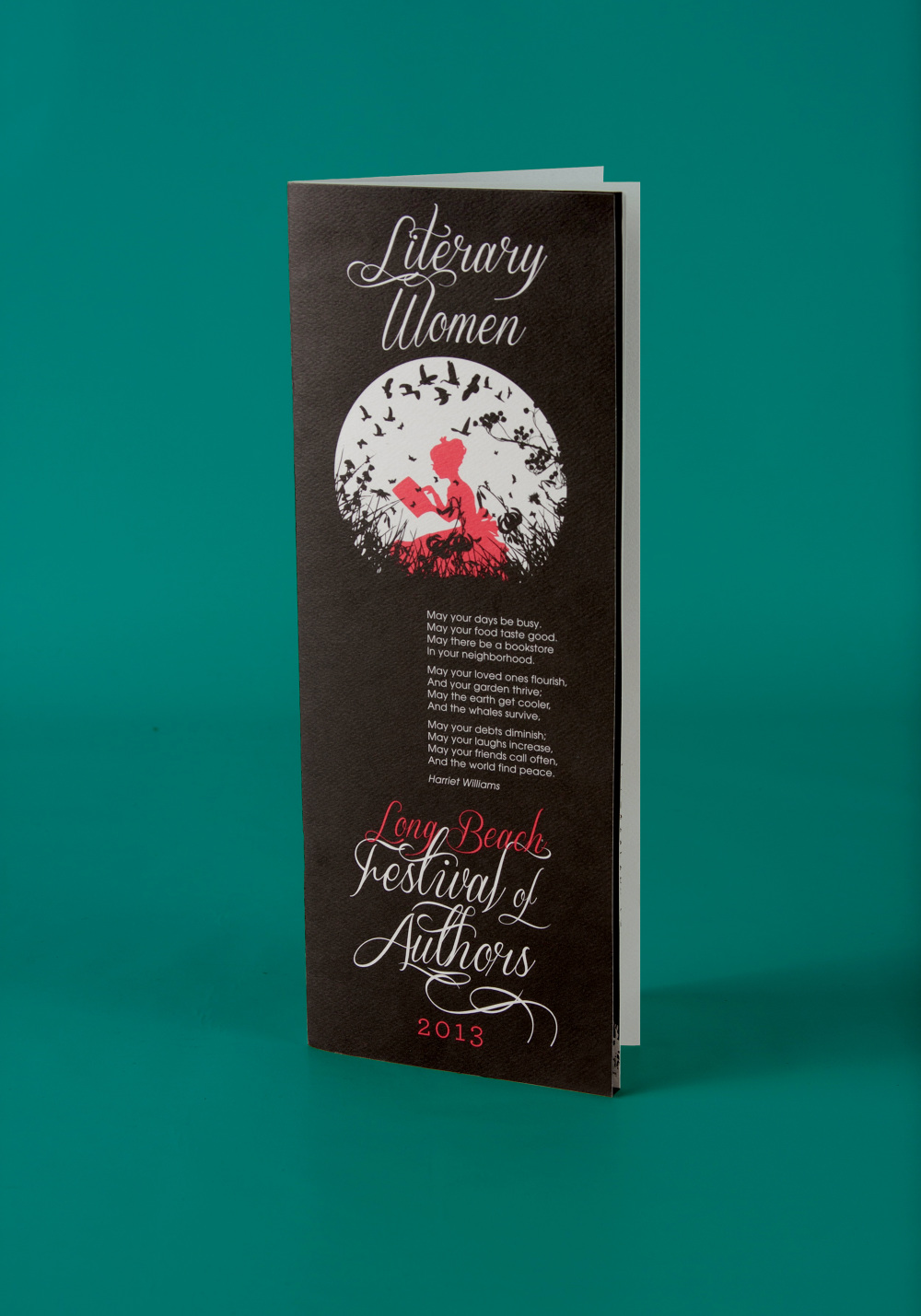
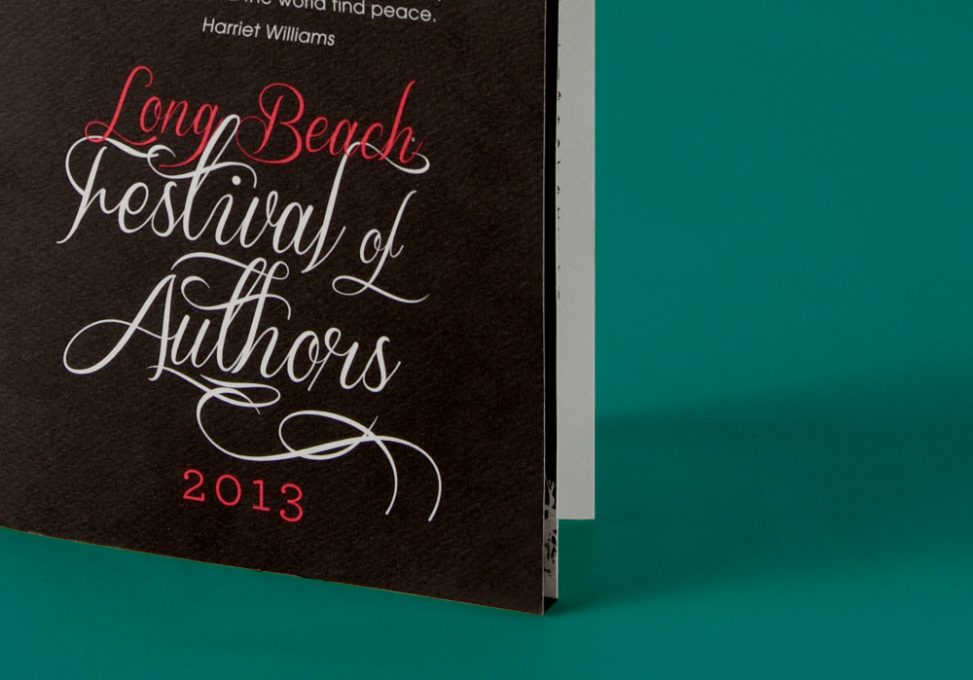
A huge challenge was the inclusion of all of the authors who had previously been honoured: hundreds of names. It was an additional challenge to work the poem into the front cover; it was written by one of the founding members of the Literary Women, and its cover placement was non-negotiable. Working with such a restricted palette gave the program a necessary added level of sophistication.
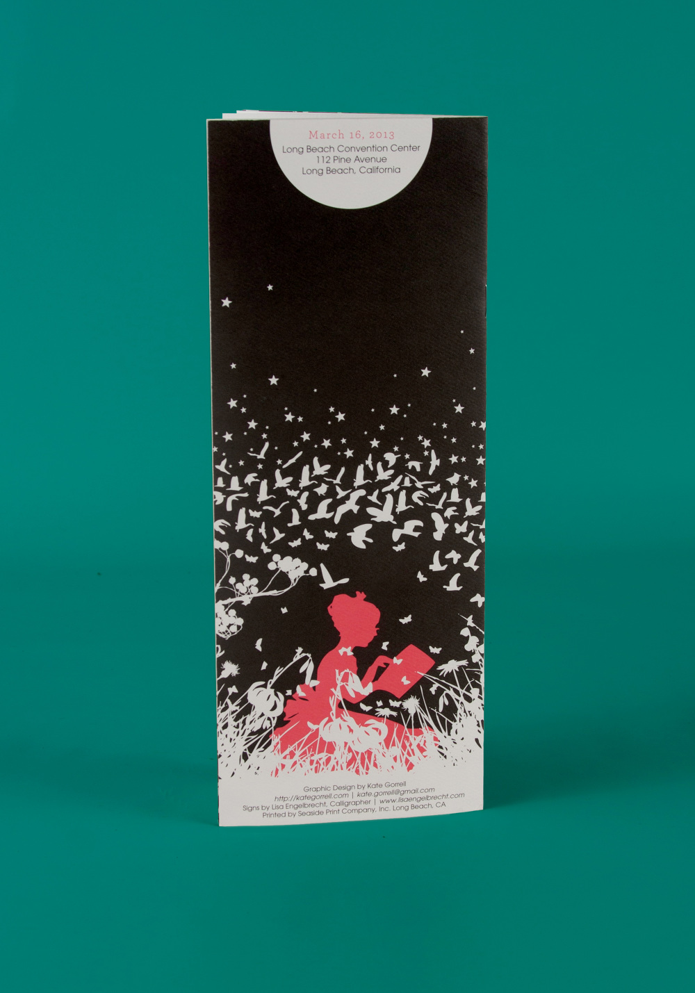
I chose a heavy-weight cold press paper for the stock, and liaised extensively with the printer in testing print qualities across materials to ensure even ink deposition and a perfect bleed and score on the thick, textured paper.