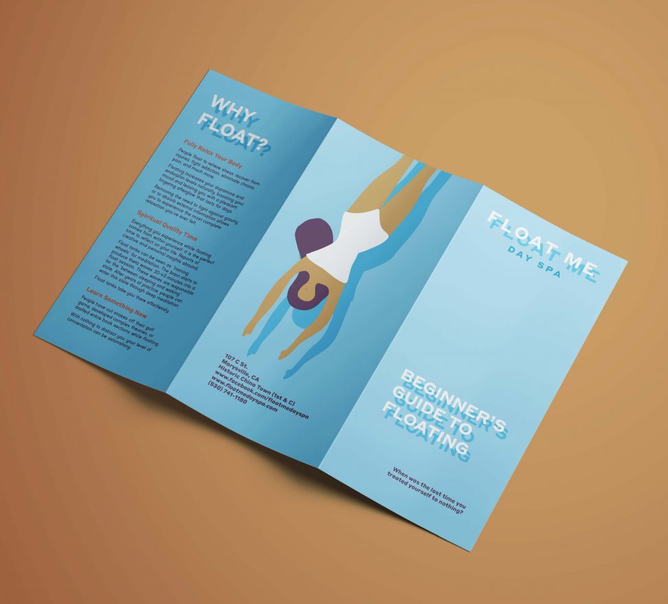
Float Me Day Spa had recently come under new management and they needed an updated brochure. They are a business that provides sensory deprivation tanks in an area where you wouldn’t expect many people to know what that entails. Thus, they were looking not only to explain their services, but also the benefits therein, and to answer some commonly asked questions.
Elements
+ Visual identity
+ Iconography
+ Printed materials
Programs
+ InDesign
+ Illustrator
Extras
+ Illustrated graphics
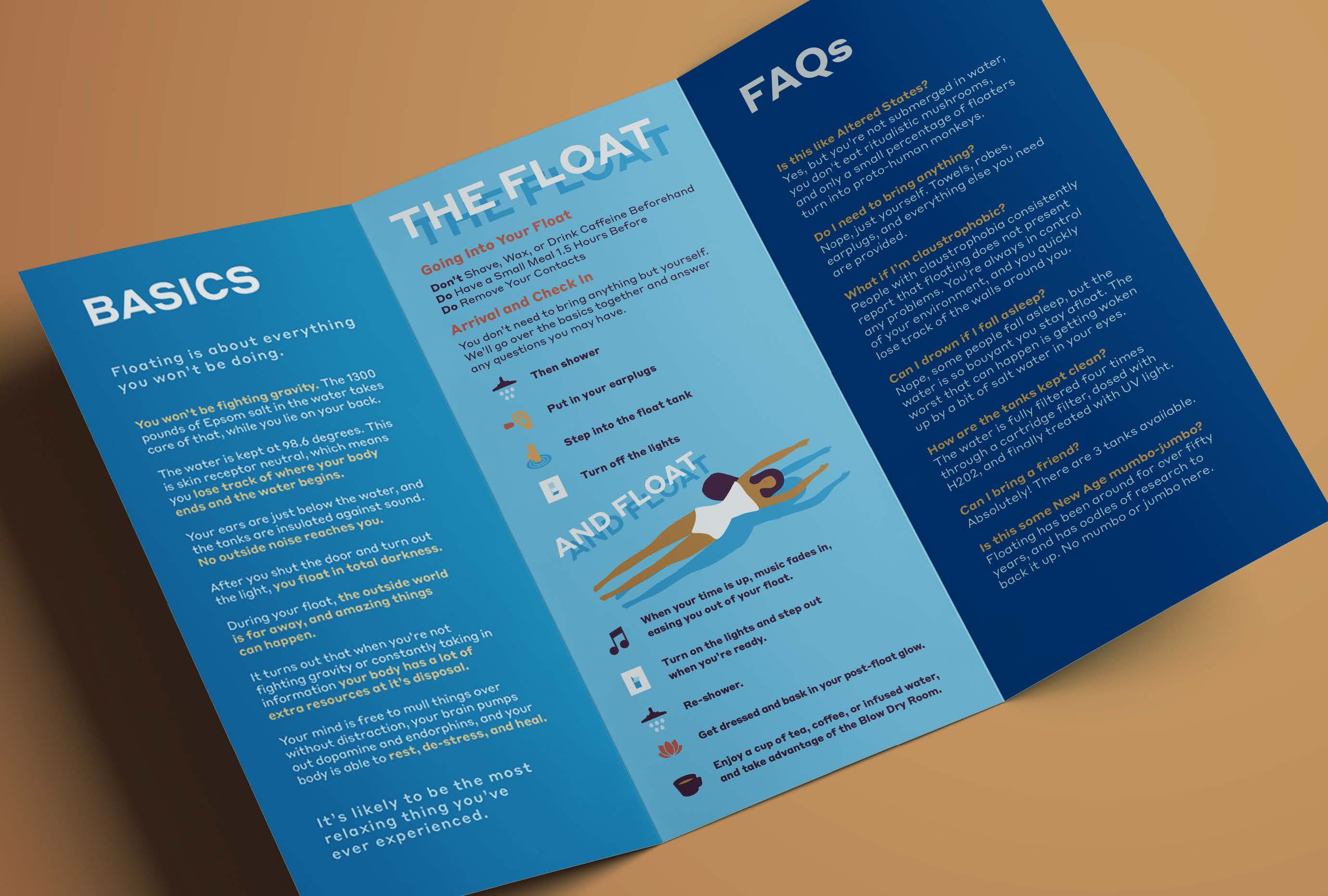
I needed to find room for quite a lot of text, but the client also wanted to spell out the steps of what happens during a float to new users. The old brochure had some enigmatic drawings, but I thought it would be better to simplify each step into an easily assimilated icon as well as to state in words what was going to happen. I wanted to keep the palette tranquil without being dull, so I decided on warm blues as background to coordinate with my warm accent colours, conjecturing a summery ocean or poolside. To further this idea, I played with having some text float by laying in a darker shadow underneath, as well as by including the drifting woman.
I used two typefaces: for the headings, a bold and clean sans serif for legibility over the drop shadow, for the body text, a slightly friendlier sans serif with rounded corners.