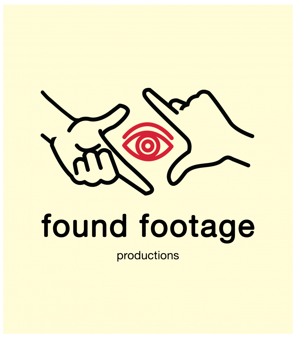
Found Footage is a film company specializing in comedic material that they self-produce. The gestalt of the name is meant to underline the concept that all the material used in the videos is scavenged rather than produced. With that in mind, I wanted to keep it the look funky, friendly, yet versatile and forward-thinking. I took inspiration from the work of my friend Max Piras and his uber-stylized icons.
Elements
+ Logo
+ Logotype
+ Motion
Programs
+ Illustrator
+ AfterEffects

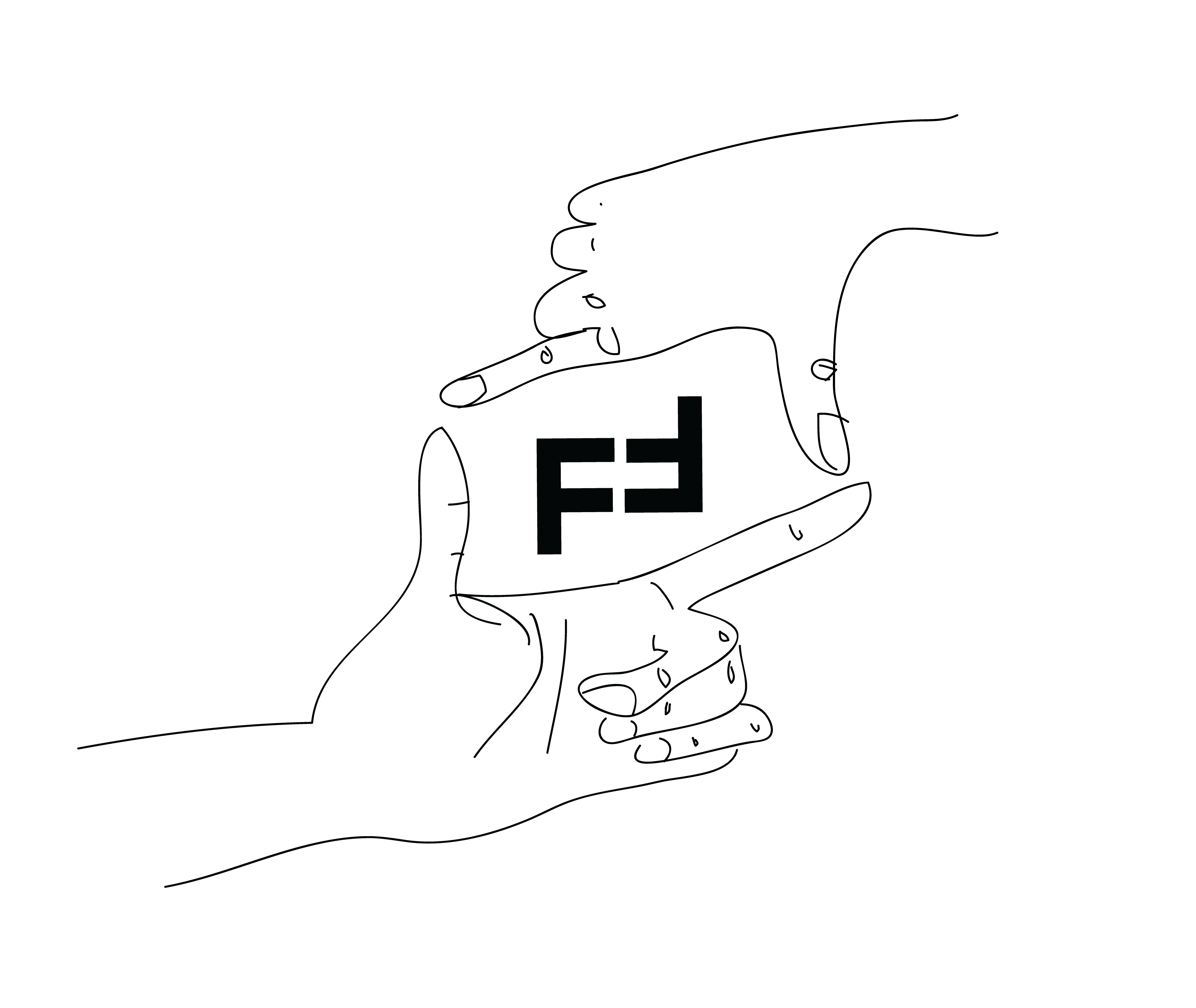
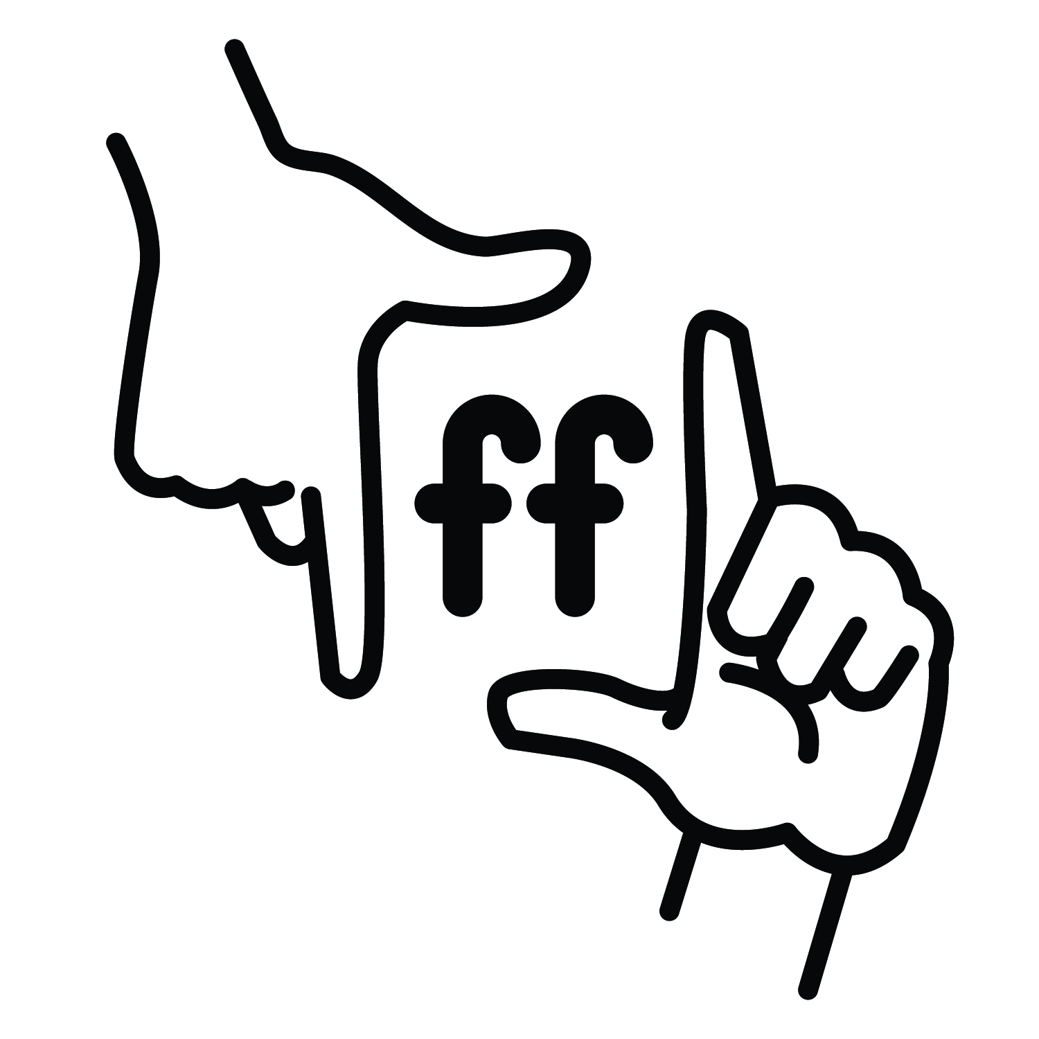
I originally conceived of using hands while brainstorming how to double integrate the letter F without it looking too blasé or ugly. I started to play around with the idea of “viewfinder” hands and how one hand is almost an F, minus the crossbar. I planned to overlay the Fs on top, but in the end just kept the hands alone. I’m still a fan of the interplay of the Fs flipped against each other, but the half of the client duo thought it reminiscent of a swastika.
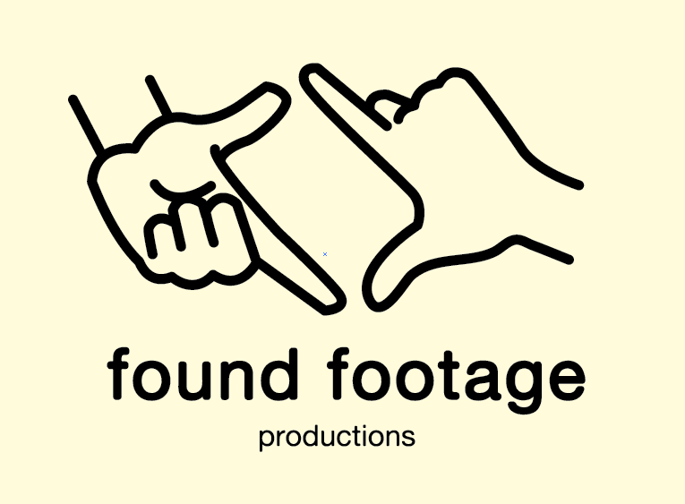
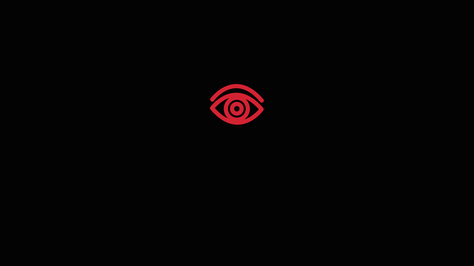
When I decided to move forward with the hands as logo-form, I wanted to create a very stylized, mono-weight version, rather than something too ornate or realistic that would detract from our concept of openness and transparency. For a long time, I worked with the hands and text alone, but kept feeling the lockup was lacking something. I then had the idea to integrate an eye between the hands, to reiterate the idea of seeing through a viewfinder. I again went for a very stylized, almost hieroglyphic format. I made it red to cognate a recording light, and in the motion sequence, you can see it flash off and on to further mimic the concept of a recording light.