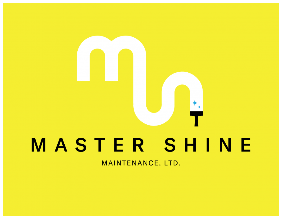
Master Shine is a cleaning company specializing in industrial spaces. The owner approached me about designing a new logo to replace the old one and to lay out some promotional flyers. What was emphasized about the logo was that it be clean and professional and include the words or initials of Master Shine.
I loved the idea of incorporating some aspect of the cleaning into the logomark and eventually landed on the concept of window cleaning, leaning into smooth, chunky linework replicating the mark left behind by a squeegee.
Elements
+ Logo
+ Printed materials
Programs
+ Illustrator
+ InDesign
I wanted to create a logo that would stand out in a field where there are many competitors, and would be usable in many different applications. I played with the letterforms of M and S at length, trying different cleaning implements to represent them in whole or in part, e.g. a vacuum hose for the S. However, I was consistently unsatisfied, and kept returning to the idea of industrial window washing, as was listed on their flyer, and highlighted to me by the owner. This is a more niche offering, as it requires the use of a bucket crane or rope system. I began experimenting with a squeegee path, which led to the final result.
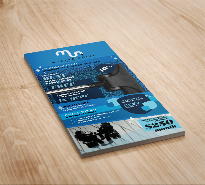
For the flyer, I kept it appealing as well as professional by implementing the shine marks from the logo in a cheeky “showbiz” style. I used a fat didone display font to contrast with the clean sans serif of the information and implemented an active blue palette in contrast to the black and white images to keep it visually interesting. There was a lot of information of different types, but I think flyers that read straight down seem a bit unconsidered and also don’t hold the interest of the viewer, therefore I utilized colour-and-shape-blocks to subset information.