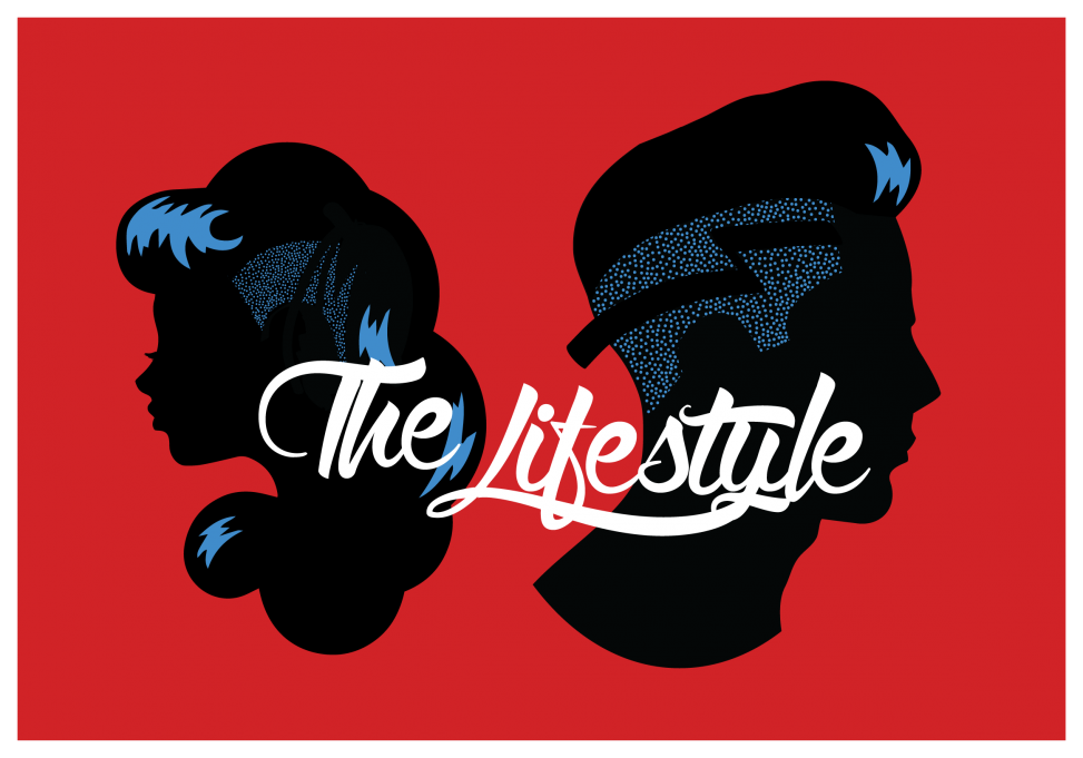
This job came in as a secondary element to a pre-existing company “The Lifestyle Barbershop”. The owner was expanding into female beauty products and wanted a logo to use for his new location that would attract both men and women.
His foregoing theme was a sort of choontie/greaser/tattoo parlor. I wanted to make it a bit edgier and clean it up, so I went with a cameo cutout overlaid with a fade, zag, and pomp for the boy and a shaved-side style for the girl in electric blue. I removed all the extra decoration from the text and laid it in as a single color.
My main concern was the lockup between girl and boy profile, and the text interaction. I feel the final version has a good interplay of curve and line, although I’m not 100% on the overlap on the girl’s hair reflections.
Red, black, and blue for that rockabilly flair.
The simple colors and styling mean that he can use it as a vinyl applique in his windows, as a box sign, on the tags of his merchandise, t-shirts, and on business cards.