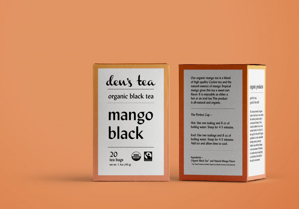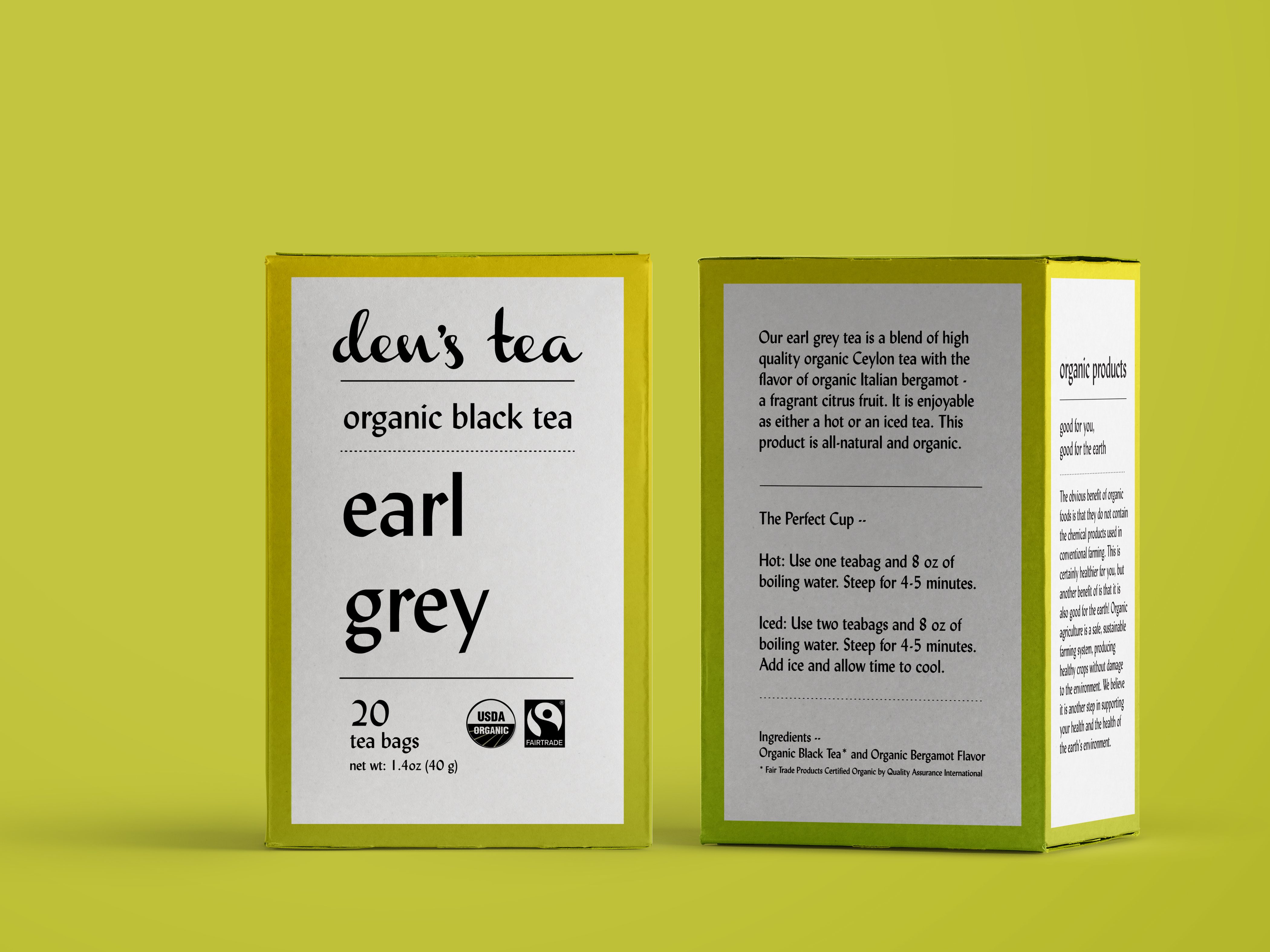
Den’s Tea has existed for three generations in Japan, but for this project, they were seeking to branch out into the American market and wanted a tea box designed specifically for the range. Den provided the die-line and copy, as well as stating that the box must display the USDA Organic and Fair Trade seals.
I went with a simple gradient background and a strong typographic solution—giving the copy a chance to shine through. The boxes are instantly discernible one from another by their specific colour-combination.
Elements
+ Visual identity
+ Package design
Programs
+ InDesign
+ Illustrator
+ Photoshop
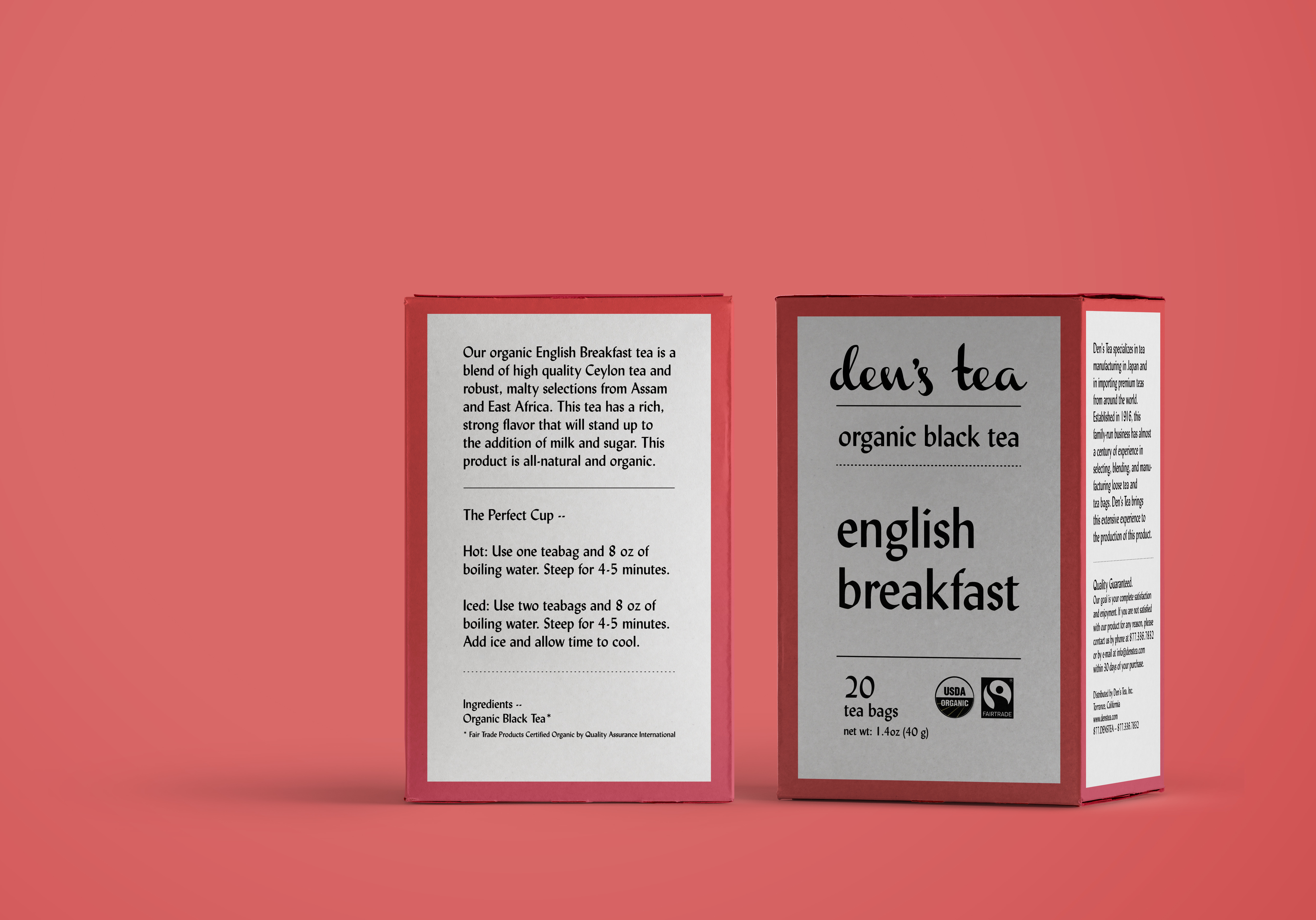
In this version, I have utilised my own conception of the Den’s Tea logo, taking my cues from the script of the original logo, but simplifying it to a single colour in an upright hand, with a stronger contrast between hairline and stroke.
To emphasize the purity and organic nature of the teas, I streamlined the design down to black and white on a smooth gradient background. Each gradient is meant to represent the colour profile of the tea; thus, Earl Grey, with its citrus notes, is a lemon-to-chartreuse blend.
The type is a Humanist sans serif, keeping the box from looking sterile while giving good readability and a pleasant appearance. I set the tea names in lowercase to enhance the concept of openness and transparency in product.
The only visual element is the inclusion of a dotted line, forming an interplay of solid and permeable between the bold text forms.