Always Fresh is an organic farm that grows all its own produce and delivers to individuals and restaurants, as well as selling at farmers’ markets.
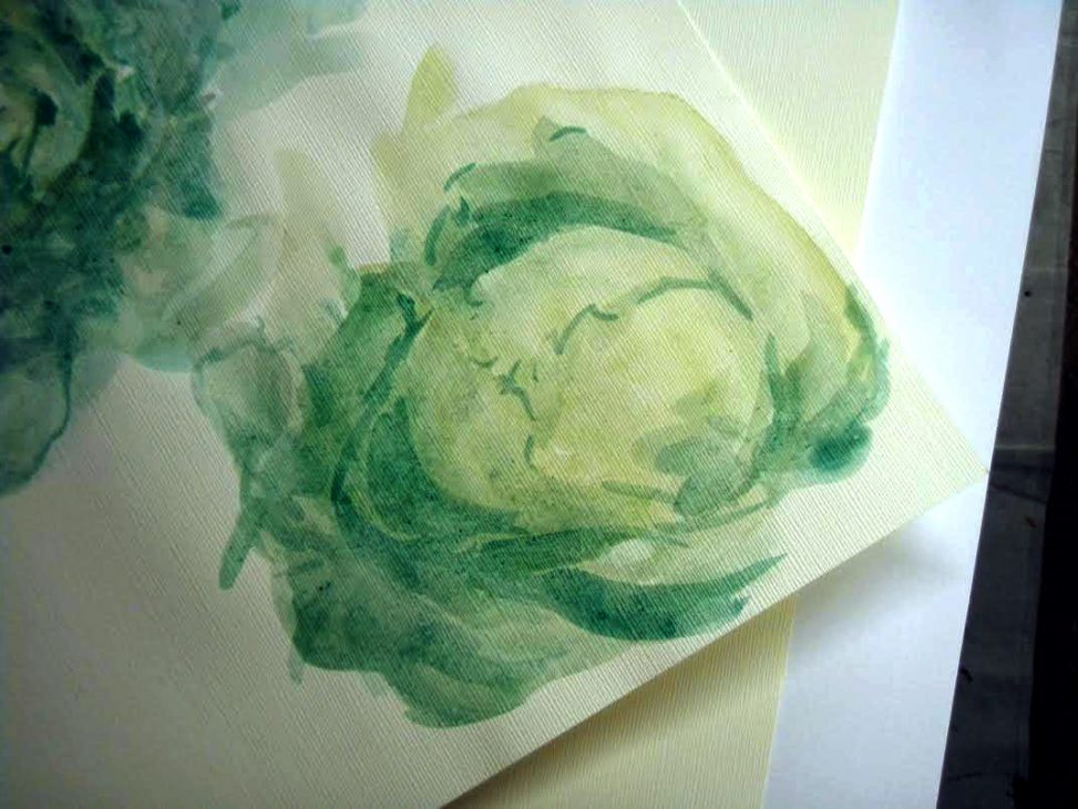
This job came in as a simple business card update, the client providing a new image for the back of her old cards. As we began discussing the update, I convinced her to allow me to provide a sample of my own work for the back that I felt was more professional and attractive. I created a series of watercolour sketches of the vegetables she grows to act as graphic elements for the brand, then moved on to develop a fresh and friendly logotype. In everything I aimed for a sustainable look that would support her in her sales to both new and old customers in far-ranging demographics.
Elements
+ Visual identity
+ Logotype
+ Illustration assets
+ Printed materials
Programs
+ InDesign
+ Illustrator
+ Photoshop
Extras
+ Watercolour
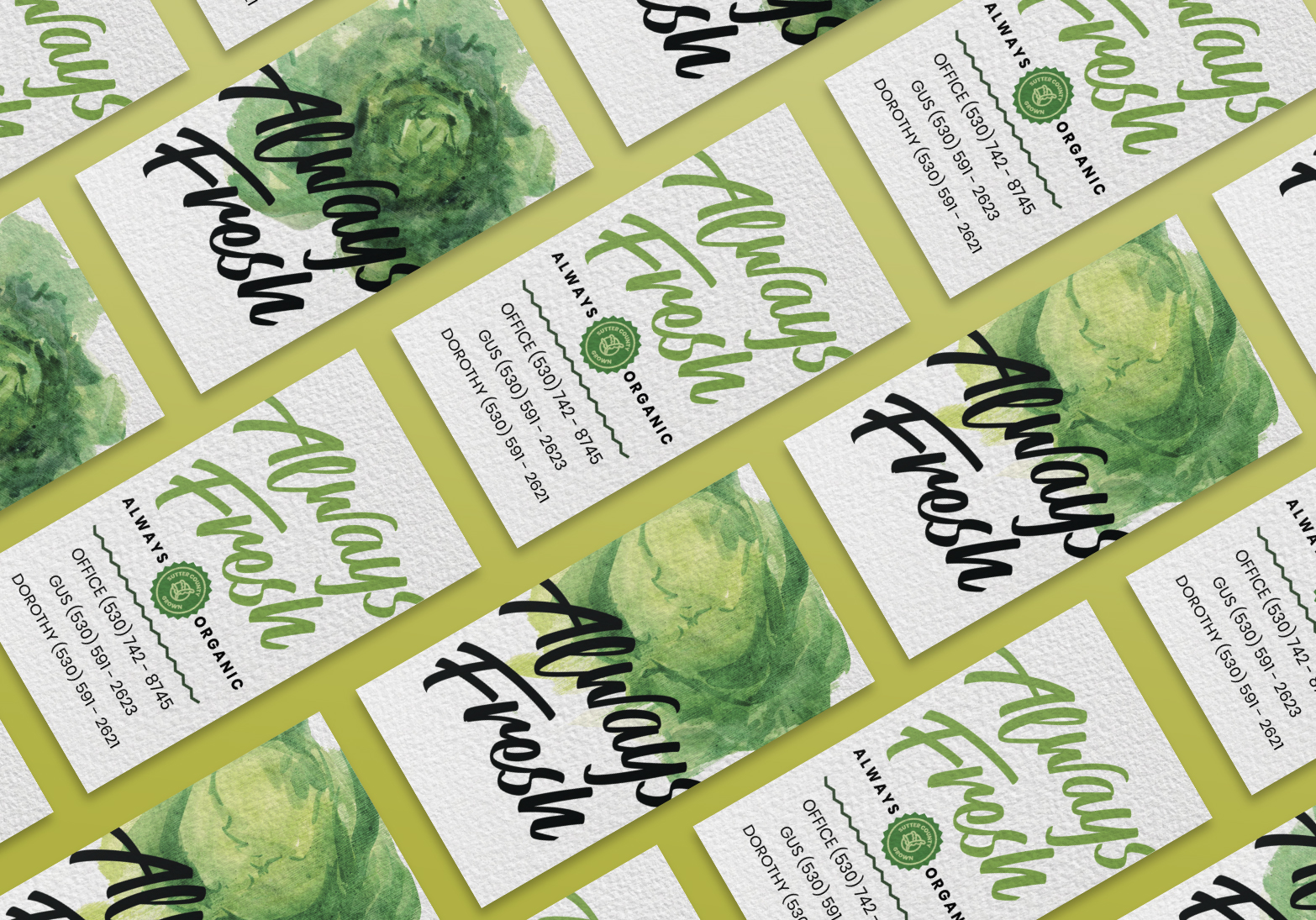
The client so loved the result that we advanced into other projects to increase brand visibility. I revised her entire line of business cards, but at the end of the design process, she couldn’t decide between with my two final concepts. I elected to provide her two discrete sets, one “hot” with tomatoes and bell peppers and one “cool” with two kinds of lettuce. I printed them on cut-down 140 lb. Strathmore watercolour paper run through our Versant printer.
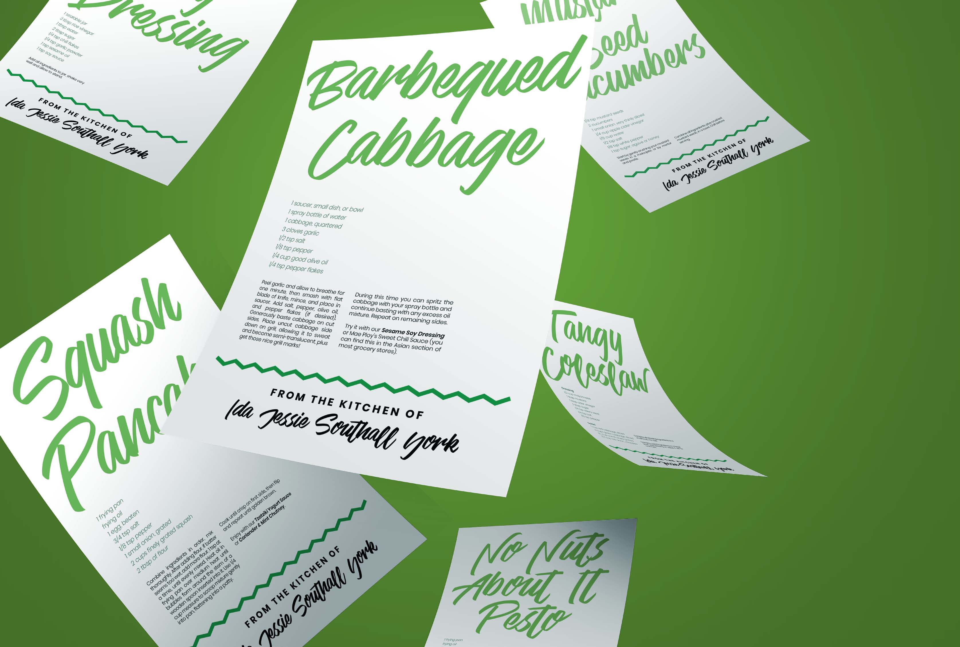
The client wished to provide recipes to clients−utilizing her mother’s own notes, to keep her memory alive. I designed these at US letter format−the most available paper size−and without a bleed, making them an item she could print herself if she ran out before a big market.
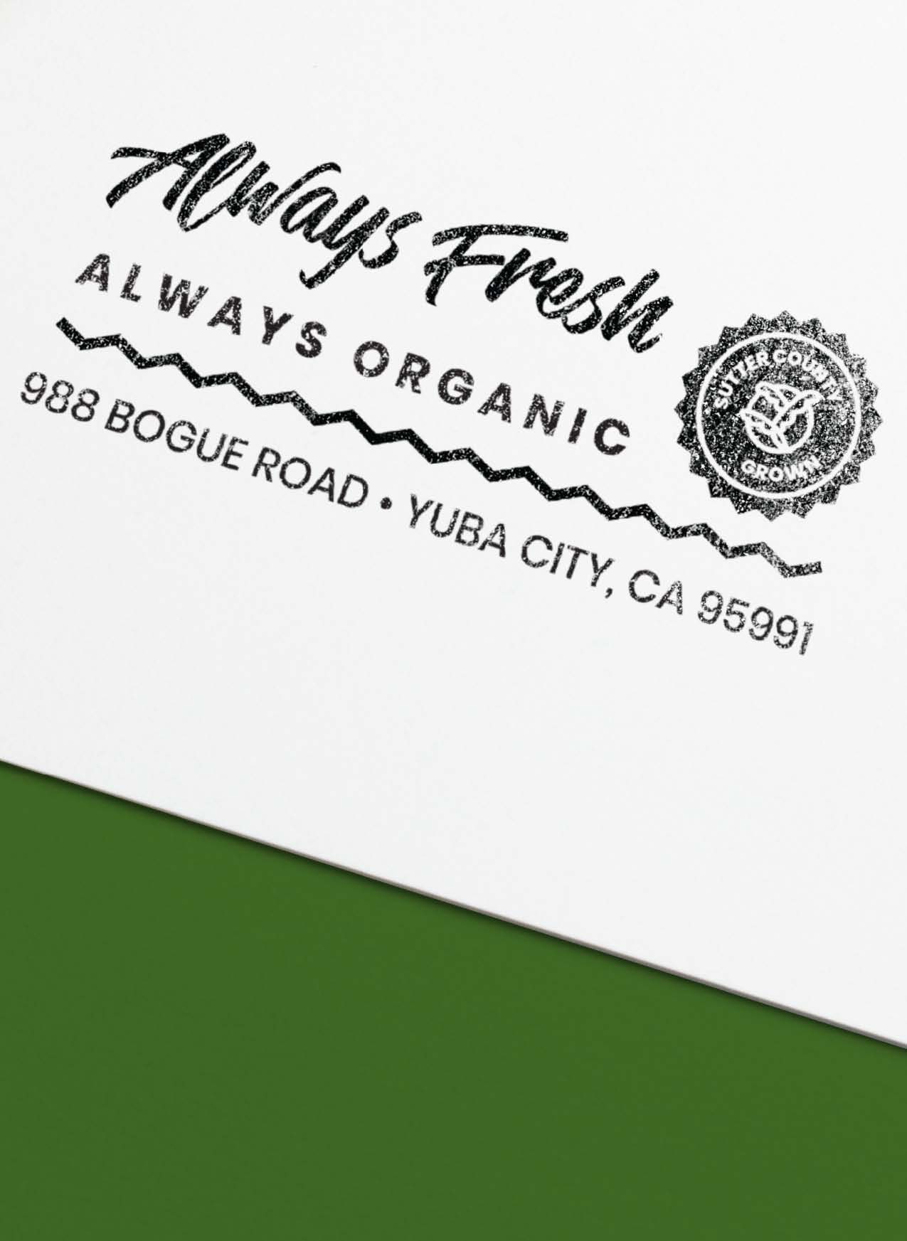
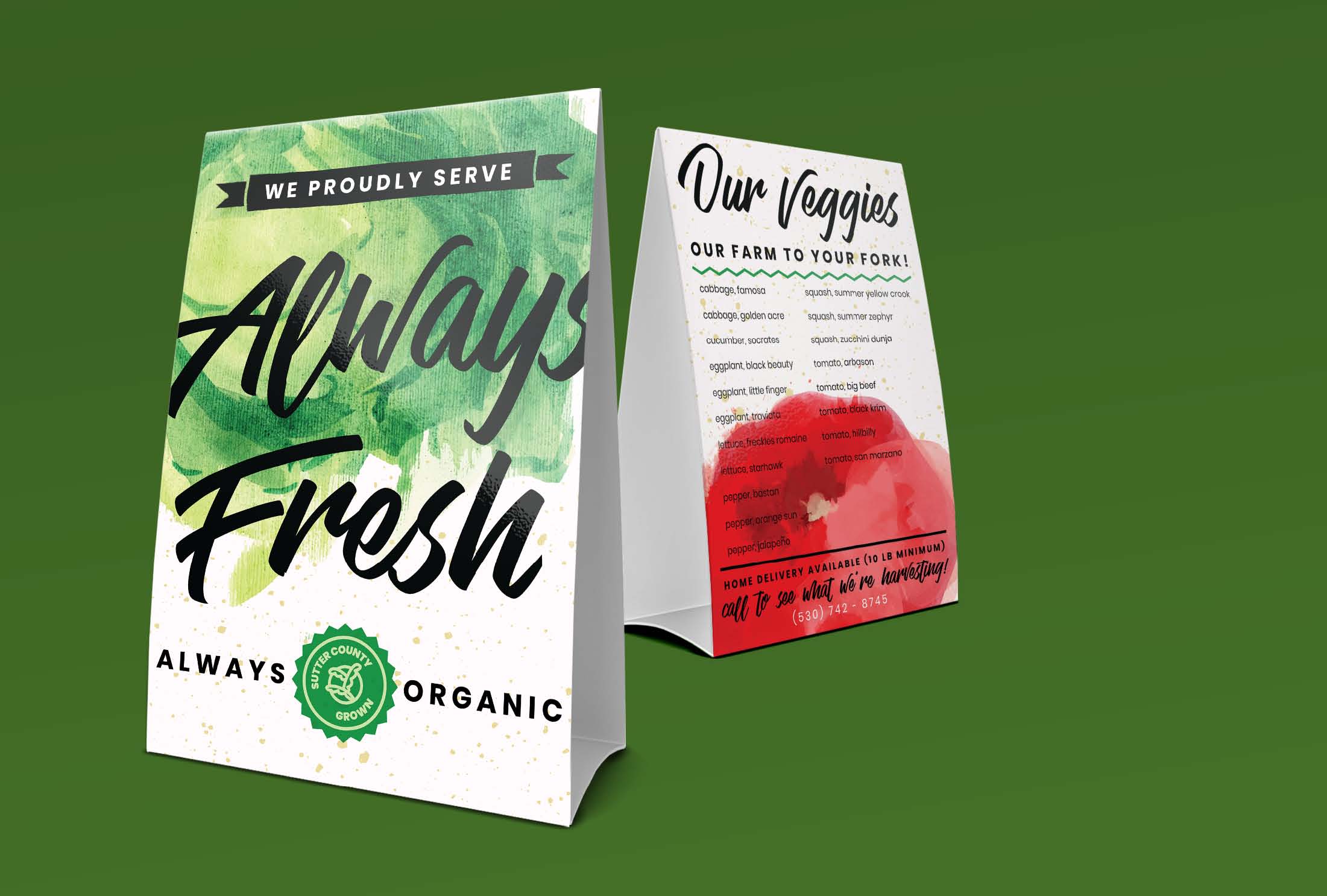
The client requested a self-inking stamp to be able to quickly mark her cardboard delivery boxes without too much thought. I used our existing components to create a lockup that catches the eye, but still prints clearly at size. I suggested producing table tents to offer to restaurants she was delivering to, listing her available produce and essentially staking her claim in the area. I added a buttermilk-speckled background to some of our preexisting layouts to keep in the farm-fresh, organic tone, then printed them with a full-bleed on coated cardstock on the Versant, trimming and scoring them by hand.
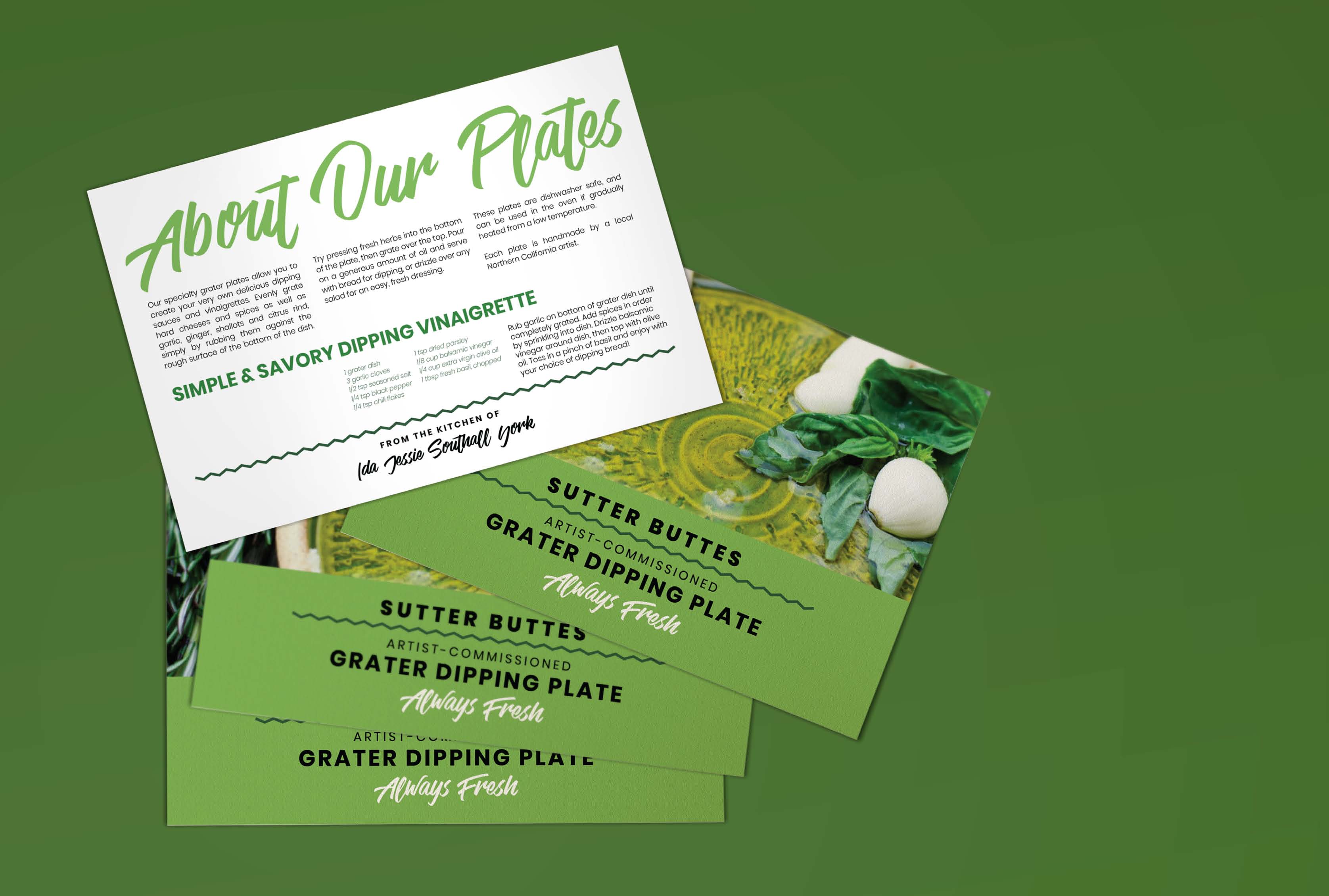
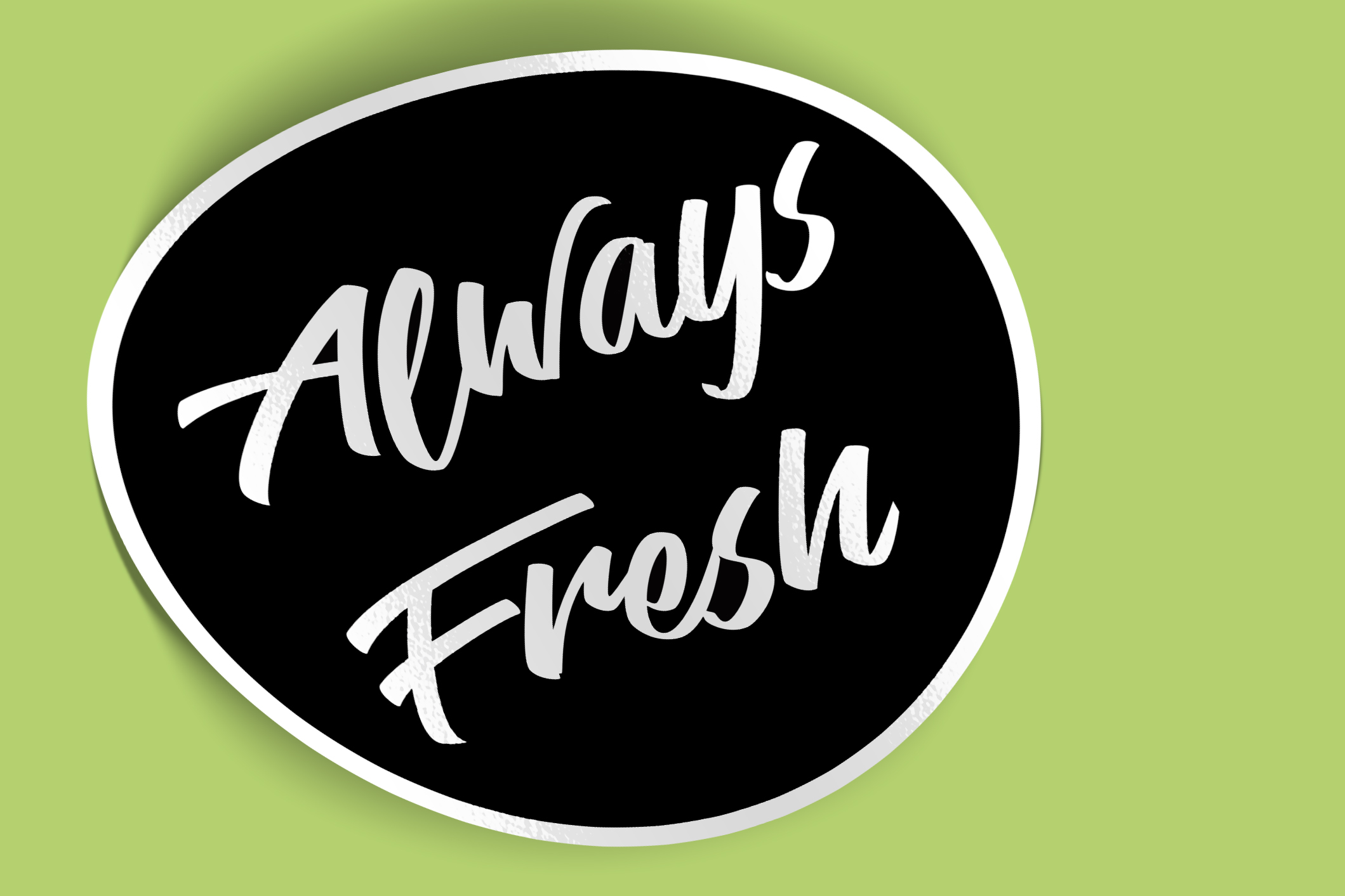
After a delivery to Sutter Buttes Olive Oil, the client began conceptualizing offering other brand-related items at farmers’ markets. She purchased a number of artisan grater dishes, and I designed the insert card for the package. I printed these full-bleed on coated cardstock. To brand the dishes, and any other current and future Always Fresh products, I created a simple sticker with her logo reversed out on a black background. These small stickers are ideal for the grater dish packages, and as seals for the top of her delivery boxes. They were printed on opaque, adhesive-backed 3M paper.