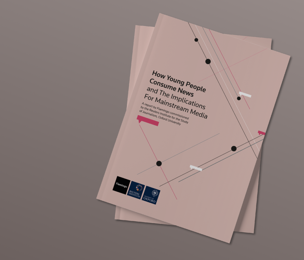
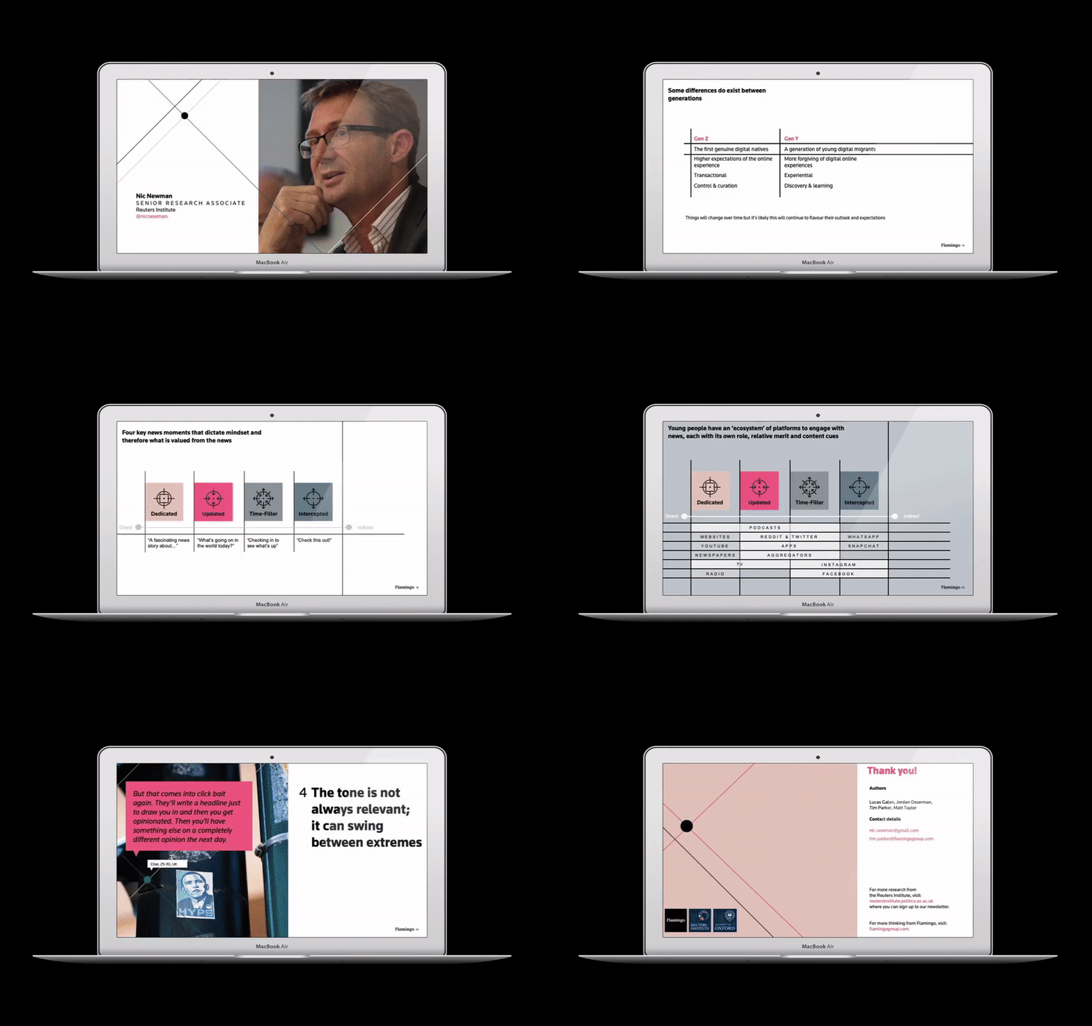
Reuters commissioned a study to find out what’s changing in how young people access news, and how news media might have to change approach to continue to draw in readers. After the research was completed, we developed the findings into a comprehensive report and digital presentation, which was used at an event at News UK, attended by multiple media outlets.
Elements
+ Visual identity
+ Digital report
+ Printed materials
+ Digital presentation
Programs
+ InDesign
+ Powerpoint
Platforms
+ LinkedIn
+ Twitter
+Mailchimp
The initial brief was how to tie together the Flamingo and Reuters brand to create a visually pleasing result that didn’t lean too far in either direction. There also needed to be a way to highlight specific sections and parts, both in the text and in the accompanying charts and visuals. Finally, there are some very specific content forms from the original report that had to be included, requiring them to be reinterpreted in the visual style.
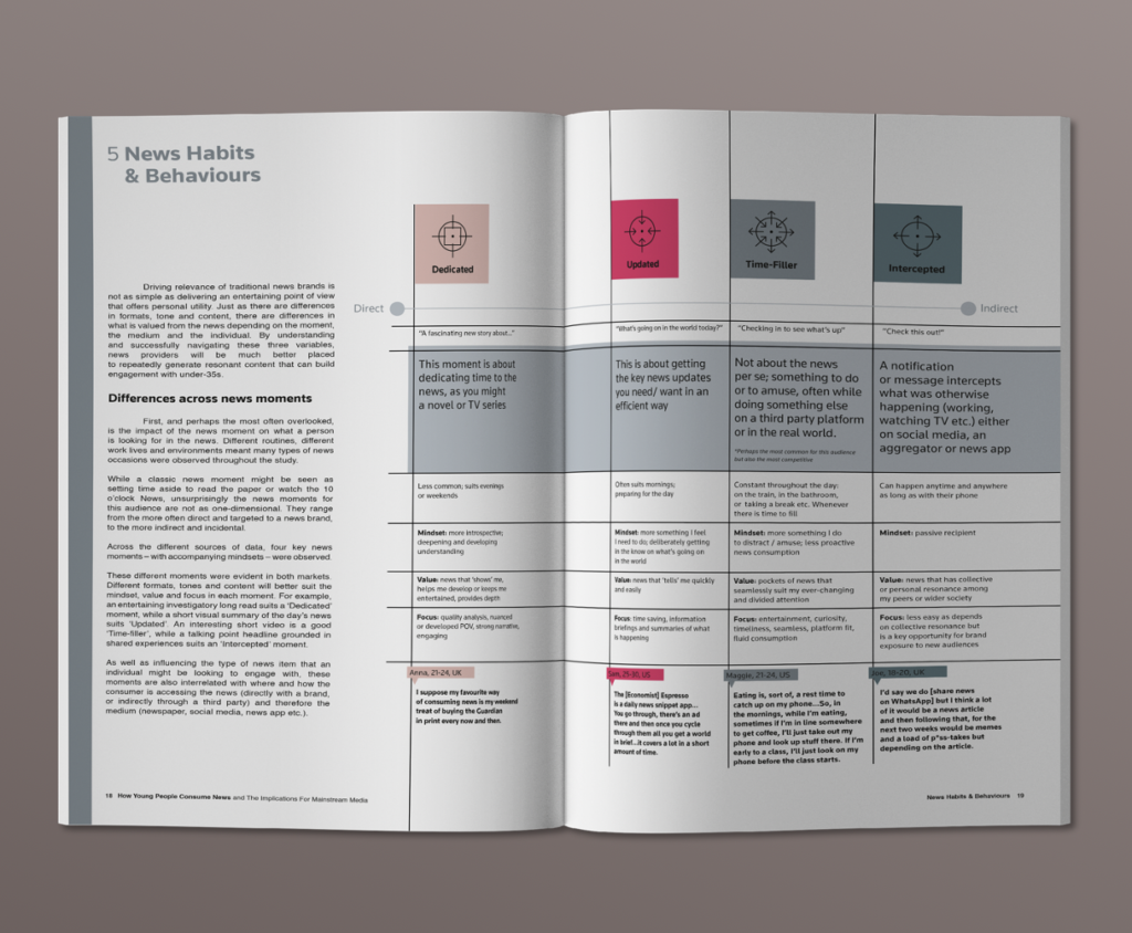
Using the Flamingo colour-ways as an overarching guide proved to be helpful in many respects. There are 3 colour options, and we decided to allow tints, which provided the differentiation necessary for the discrete elements. We further introduced a blue-grey and its tints as a secondary neutral and as a visual signal within the report that didn’t conflict with the panoply of other shades.
To loosen up the formality of so many charts and chunks of text, we employed a slight overlap of colour—giving the sense of depth and layers, and a bit of dynamism.
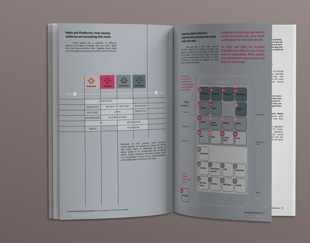
A consistent visual element was the text box, which appears throughout the report in various colours and sizes. As the report was formed, in a large part, through interviews and direct quotations, we thought the inclusion of the quote bubble was a great way to break up the extreme amount of cited material, and also to underline the concept of verbal data that threads through the report.
View the full report here.
