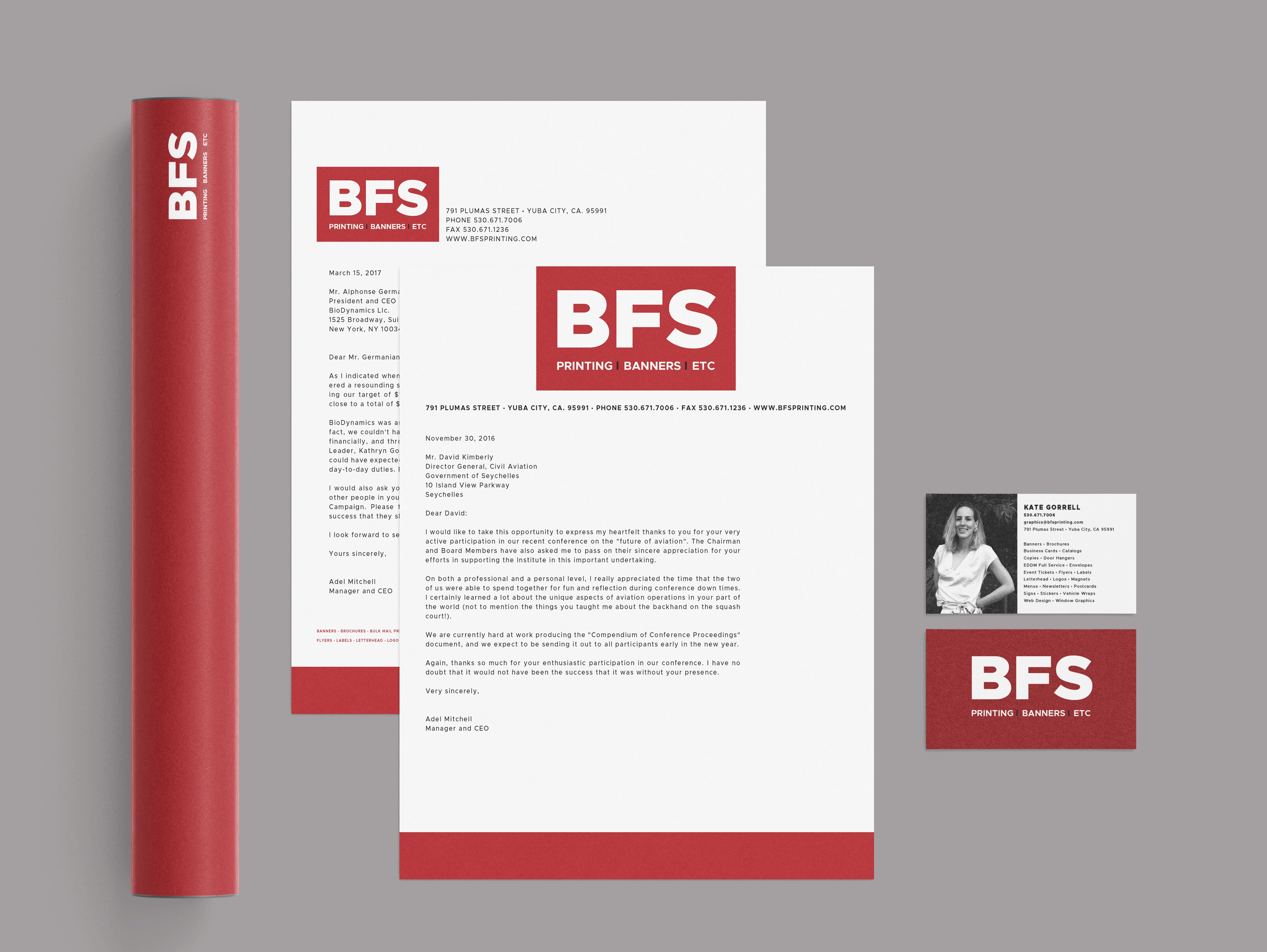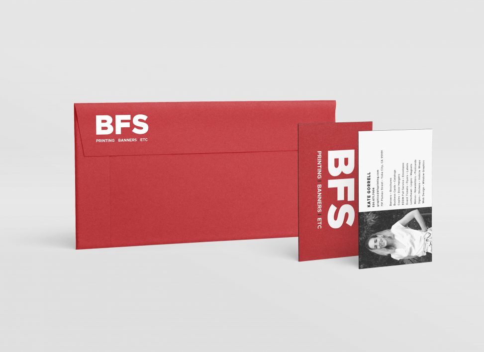
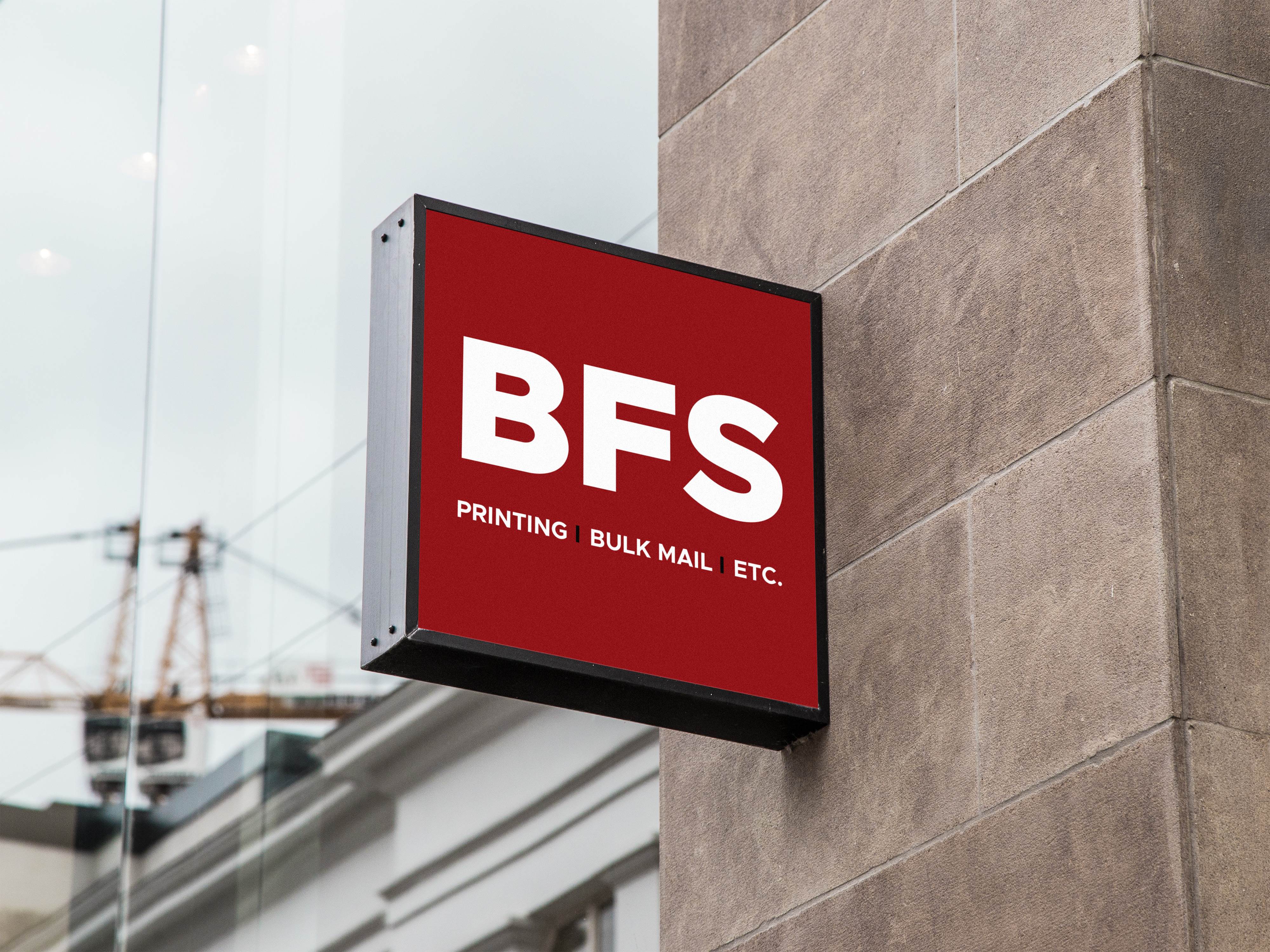
When I first began working at BFS Printing, Bulk Mail, Etc, every time I was called to use the existing logo for any sort of marketing or watermarking I felt embarrassed. I felt the logo came across as extremely dated and did nothing to gain new clientele, or even to encourage the retention of old. I decided to revise the logo into a basic, workable format which could be used across applications and which would give us a much stronger, cohesive presence as a company.
Elements
+ Visual identity
+ Logotype
Programs
+ Illustrator
+ InDesign
There were technically no necessary inclusions besides the use of the colours burgundy, grey, and white, so I had rather a free rein. I simplified it as much as I thought I could get away with. I implemented a very bold sans-serif to strike the eye of the viewer and imprint in the mind; hoping people might take it for a monogram rather than an acronym.
After submitting the logo for my boss’s approval, I was requested to update our business cards, letterhead, stickers, notepads, et al, with the new style.