Dot Dash is a video and photographic production company started by the Disney brothers, which has now expanded to include several other partners. Originally, the company shot a variety of video types, from promotional to drone flyovers. Recently, they made a successful transition into the area of upmarket wedding videos.
Elements
+ Logo
+ Logotype
+ Motion
Programs
+ Illustrator
+ AfterEffects

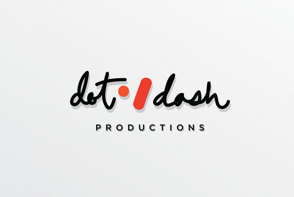
When I developed the logo, I wanted to keep it clean, fresh, but open to interpretation. I liked the concept of organic marks, and felt a playful logo would best fit with their business model. I originally wanted to use a more ink blot style for the marks themselves, but felt it would be hard to translate to multiple applications, and perhaps a bit too artsy. The final version is a reductionist iteration of the concept of freeform imprints.
I chose an energetic red and orange, so close in hue as to almost vibrate off each other. The logo can also be used in plain black or white as a photographic or video overlay.
For the text, I had considered using founder Drew Disney’s personal handwriting, but it was literally illegible, so I sketched my own version. I wanted a bold, active, felt-marker type of script, and went through many pages of sketchbook trying to find the perfect version. I balanced the final lockup against a wide-kerned sans serif.


Leave a Reply