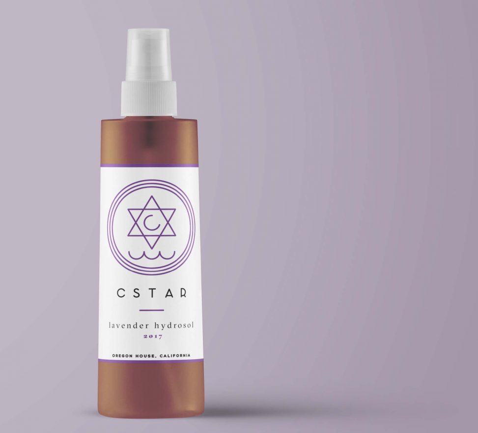
The client was seeking both a logo and a label for his line of lavender hydrosols. The extent of his existing brand was the name C-Star, the visual concept of a C inside a six-pointed star, hovering above the waves, and a non-specific purple hue. Working within these guidelines, I devised a clean, refined logo that can be used across multiple applications, yet still carries a magical, druidic potency within its esoteric symbology.
Elements
+ Logo
+ Packaging design
Programs
+ Illustrator
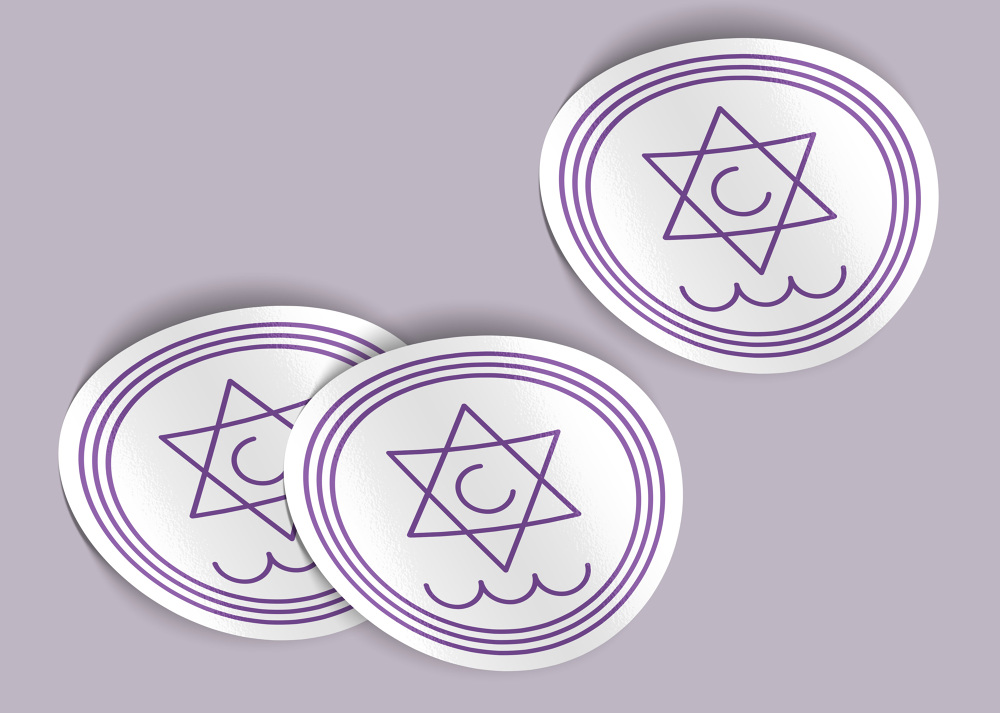
To allude to the crescent moon, I tilted the C, then stylized the waves, and thrice encircled the rune for cohesion and emphasis. The soft mauve reflects the delicacy of the hydrosol itself.
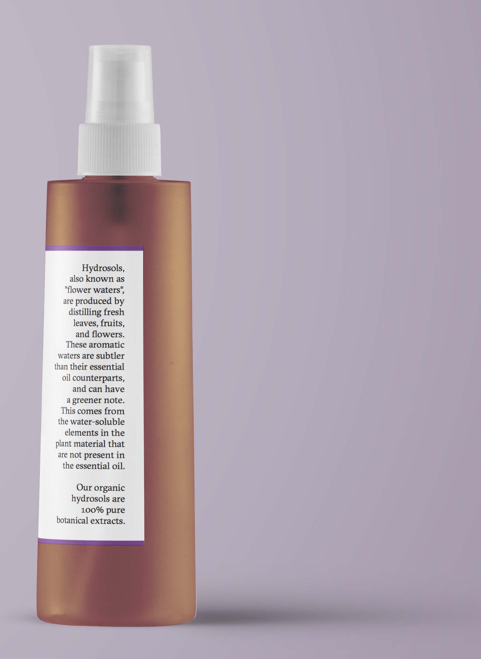
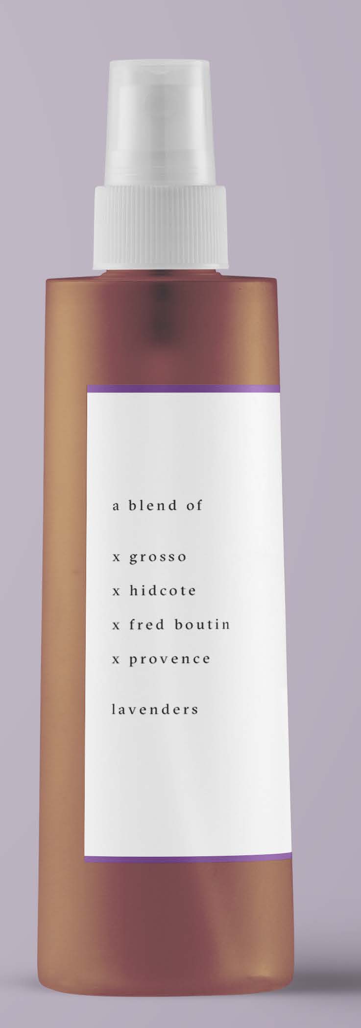
C-Star was reworked into C S T A R, in what could conceivably be a sort of natura-futura beauty brand, and set it in a mono-weight sans serif to echo the mono-weight logo. In order not to stray too far from the holistic roots of the brand, I set the rest of the text in a modern serif that would also be crisp and legible at small sizes. For the list of lavender types, instead of bullet points, I used the Xs one finds for flower strains, to underline the botanical-driven aspect of the product.
Both the label and subsequent stickers were printed on opaque, adhesive-backed 3M paper, laminated, and contour cut before application.
Leave a Reply