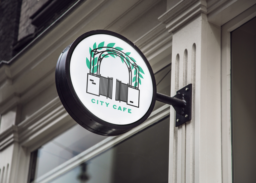
City Cafe is a Plumas Street staple in downtown Yuba City. It has recently come under new management and asked for an update on the look. The logo concept was taken from their entranceway, which has a memorable vine-covered arch. Keeping it simple but fresh gives City Cafe the opportunity to showcase its diverse and seasonal menu.
Elements
+ Logo
Programs
+ Illustrator
The old logo, 2 interlocked Cs, doesn’t convey any sort of emotive aspect, and in fact, feels dated and low-brow. City Cafe is actually quite an upscale venue, tucked away behind a vine-covered gate and courtyard, and their prices reflect that. I always felt, working with the old logo, that there was a disparity between product, price, and persona–$18 for a steak salad from a place with a diner-style logo?
![]()
I wanted to give them a logo that was fresh and au courant; a representation of the physical space that would generate a feeling of familiarity and nostalgia for old customers, but presented in a way that would attract new interest to the restaurant.
The logo is quite “trendy”, yet the sheer simplicity of concept gives a multifarious application ability and longevity. As we move away from the gradients and three-dimensional logoworks of the early twenty-teens, clean and straightforward is the goal.